Lying with Statistics
Lets explore four plots and see how we can #LieWithStatistics…
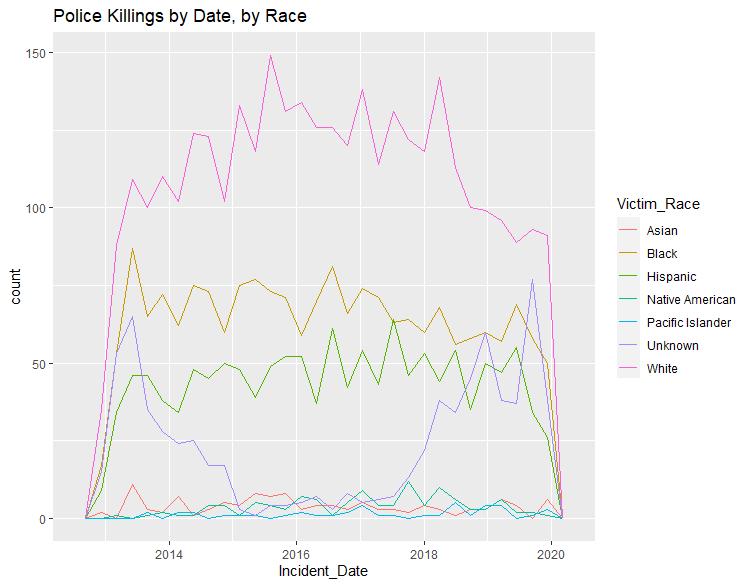
Plot 1: Police killings by date, by race
General observation: Police kill more white people than black people
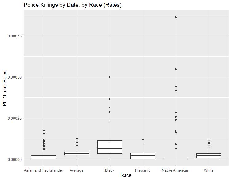
Plot 2: Police killing boxplot showing murder rates, by race, by police department
General explanation and takeaway: The dots on each boxplot show the statistical outliers, box plot lines extend out to the “min” and “max”, and the box lines (from bottom to top of each box) represent the first quartile (25th percentile), median (50th percentile), and third quartile (75th percentile)
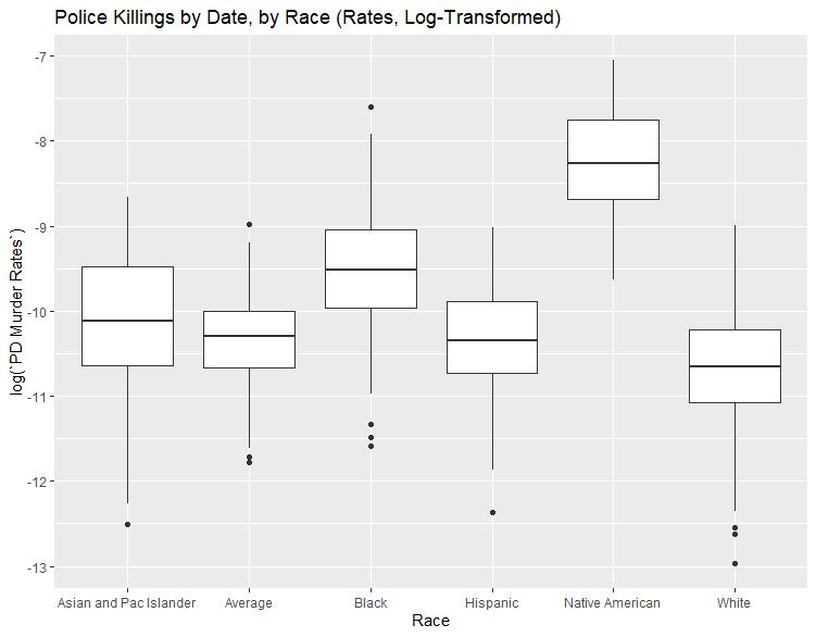
Plot 3: Police killing boxplot, now log-transforming the murder rates to more easily identify statistical differences, by race
General explanation and takeaway: Log-transforming data points for visualization or modeling purposes is a technique by which you can smooth observed data making it more robust (or resistant) to outliers. I effectively re-wrote the murder rates to show exponential relativity.
Important caveat: Are Native Americans more likely to die by police than other races? Sure looks like it… but see Plot 4 for more thoughts
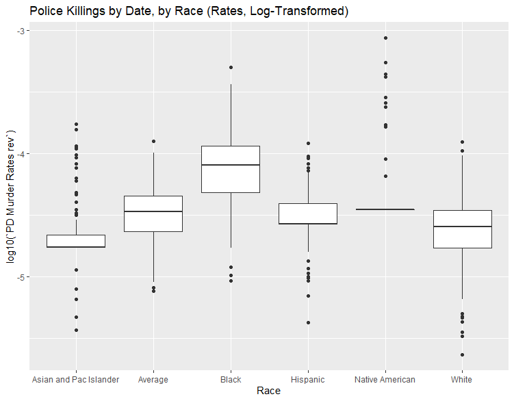
Plot 4: Police killing boxplot, now log-transforming the murder rates using a log base 10 (easier interpretability) and “fixing” the Native American data points causing a misleading assumption in Plot 3, i.e., Native American death rates appeared much higher than others in Plot 3 given the fact that log(0) = 1.
General takeaway: There were such few Native American data points that log-transforming all of the zeroes was unintentionally bastardizing the analysis. It would appear black people are almost an order of magnitude more likely to be killed by police than white people.
I do not seek to answer questions of “why” systemic injustice exists in the US, but I wanted to analyze police killing data and share these dialectical investigations.
Source:
* Samuel Sinyangwe & the Mapping Police Violence team